Lite Studio Webclip

Simplify Your Website. Elevate Your Brand.

Schedule a call with our expert web design and answer engine optimization team today to discuss how we can improve search visibility and upscale your brand's online presence in just 30 days.

Schedule Call

How Webflow Supports Reduced Motion Preferences

Calix Xavier
April 22, 2026
Webflow's native reduced motion support handles smooth scrolling automatically on published sites, but custom animations and parallax effects require manual CSS or JavaScript intervention. Understanding both the platform's defaults and its limits is essential for building genuinely accessible, motion-safe web experiences.

Article Summary

What does Webflow do natively to support reduced motion preferences?

Webflow automatically detects the prefers-reduced-motion setting from a user's operating system or browser using standard CSS media queries and adjusts smooth scroll behavior accordingly. When reduced motion is enabled at the system level, anchor link clicks skip animations and jump instantly to the target section rather than scrolling smoothly. This behavior has been in place since April 6, 2021 and requires no manual setup from the designer.

Why does reduced motion behavior only appear on published sites and not in Designer preview?

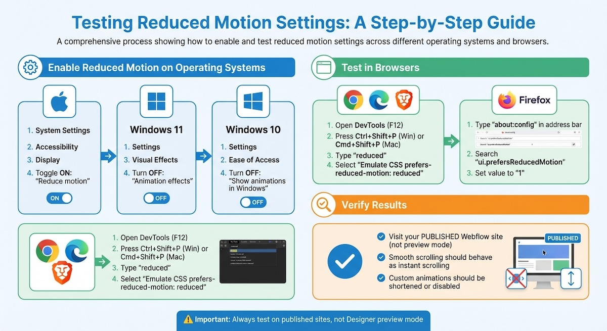
Webflow's Designer preview mode always displays animations regardless of a user's system-level reduced motion settings. The prefers-reduced-motion detection only functions on live published sites, meaning designers must test reduced motion behavior on a published or staging domain rather than relying on the preview to accurately represent the experience for motion-sensitive users.

How can designers disable Webflow's IX2 animations for users with reduced motion preferences?

Because Webflow's IX2 interaction system does not include a built-in toggle for disabling animations, designers must use a JavaScript snippet to detect reduced motion preferences via window.matchMedia and call Webflow.require("ix2").destroy() to stop all interactions when reduced motion is enabled. The script should be placed at the very top of the footer custom code to prevent a brief flash of animations before it runs, and inline styles such as will-change and opacity: 0 should be reset to prevent elements from becoming stuck in pre-animation states.

What is the CSS approach to handling reduced motion without using JavaScript?

Designers can use the @media (prefers-reduced-motion: reduce) CSS rule to shorten animation durations to 0.001ms rather than fully disabling them, which preserves the function of any JavaScript listeners that rely on animationend events while effectively making animations imperceptible to users. This approach is applied globally using a universal selector and added to the project's custom CSS, providing a non-JavaScript fallback that covers most standard animation scenarios.

How should designers test reduced motion implementations across operating systems and browsers?

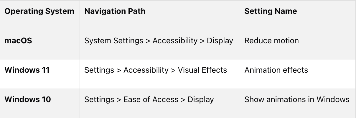
On macOS, reduced motion is enabled under System Settings, Accessibility, Display. On Windows 11 it is found under Settings, Accessibility, Visual Effects, and on Windows 10 under Settings, Ease of Access, Display. For browser-level testing, Chrome, Edge, and Brave support emulation through DevTools using the Command Menu to select prefers-reduced-motion: reduced, while Firefox allows simulation by setting ui.prefersReducedMotion to 1 in about:config. All testing must be performed on the live published site, not in the Designer preview.

Webflow helps users with motion sensitivities by respecting reduced motion preferences set on their devices. This is done through the prefers-reduced-motion media query, which minimizes animations that might cause discomfort, such as dizziness or nausea. Key features include:

  • Automatic detection: Webflow adjusts smooth scrolling based on system settings, skipping animations for users with reduced motion enabled.
  • Customization options: Designers can use CSS or JavaScript to further reduce or disable animations.
  • Testing guidance: Reduced motion settings must be tested on live, published sites for accurate results.

How Webflow Handles Reduced Motion Preferences

Automatic Detection of System Settings

Webflow automatically picks up on the prefers-reduced-motion setting from a user's operating system or browser. This is done using standard CSS media queries, so there's no need for manual setup. The platform respects the user's device-level preferences by default.

For example, if a user with reduced motion enabled clicks on an anchor link, Webflow will skip animations and jump straight to the target section instantly [1][7]. This feature, introduced on April 6, 2021 [7], is part of Webflow's commitment to prioritizing user preferences over author-defined settings [1].

However, more intricate animations or effects, like parallax scrolling, require manual tweaks. Designers need to use custom CSS media queries to adjust these interactions for users who prefer reduced motion [2][8]. For guidance on handling these advanced interactions, check out the customization section. This distinction helps clarify how Webflow handles reduced motion in different scenarios.

Behavior in Published Projects vs. Previews

It's important to note that reduced motion settings only affect smooth scrolling on published sites [1]. In preview mode, animations will still appear, even if the user has reduced motion enabled. The Webflow Help Center explains:

Reduced motion operating system or browser settings only affect smooth scroll behavior on published sites. Site previews will still show smooth scroll animation, even if reduced motion has been selected as a user preference. [1]

Because of this, designers should always test reduced motion behavior on live, published sites instead of relying on the Designer's preview mode [1]. Using a staging domain or publishing the site ensures that you see how the site behaves for users with motion sensitivities, providing an accurate representation of the final experience.

Allow Users to Instantly Disable Animations on Your Webflow Site.

Customizing Reduced Motion Settings in Webflow

Webflow provides several options to adapt animations for users who prefer reduced motion. These methods ensure your site remains accessible while maintaining functionality.

Using Custom Code with Prefers-Reduced-Motion

Since Webflow’s IX2 system doesn’t include a built-in toggle to disable animations, you can achieve this with a JavaScript snippet. Add the following script before the closing </body> tag to detect reduced motion preferences via window.matchMedia. If reduced motion is enabled, the script will stop all Webflow interactions:

Webflow.require("ix2").destroy();

To prevent a brief flash of animations before the script runs, place it at the very top of your footer custom code. Additionally, reset inline styles (like will-change and opacity: 0) to ensure elements don’t get stuck in their pre-animation states [9].

CSS Media Queries for Reduced Motion

If you’d rather avoid JavaScript, you can use CSS media queries to handle reduced motion settings. By applying the @media (prefers-reduced-motion: reduce) rule, you can significantly shorten animation durations without fully disabling them. Add this code to your project’s custom CSS:

@media (prefers-reduced-motion: reduce) {
 * {
   animation-duration: 0.001ms !important;
   transition-duration: 0.001ms !important;
 }
}

This technique ensures that JavaScript listeners relying on animationend events continue to work as expected [8].

A great example of this approach is the No-Code Conf 2021 website, designed by Corey Moen, Webflow’s Manager of Web Design. Moen used separate SVG frames for animations and applied the media query to replace animated elements with static ones when reduced motion was detected. This thoughtful design earned the site an Awwward and ensured accessibility for users with motion sensitivities [2]. As Moen remarked:

Just because I can do something doesn't mean I should... as web designers, we have a responsibility to consider the potential for harm in everything we build [2].

For cases where even native behaviors need overriding, refer to the next section on Webflow’s native settings.

Using Webflow's Native Settings

Webflow automatically adjusts smooth scrolling for users with reduced motion settings. However, other animations require manual adjustments [1]. To disable smooth scrolling for all users, regardless of their system preferences, use this JavaScript snippet:

document.body.setAttribute('data-wf-scroll-motion', 'none');

This code completely disables Webflow’s default smooth scroll behavior [1]. It’s important to note that Webflow’s Designer lacks native accessibility controls for animations. To fully support users with vestibular disorders - an issue affecting over 70 million people - you’ll need to supplement animations with custom CSS or JavaScript solutions [8].

Testing and Verifying Reduced Motion Implementations

How to Enable and Test Reduced Motion Settings Across Operating Systems and Browsers

Once you've added custom code or CSS for reduced motion, it's crucial to test your live site to ensure the changes work as intended. Testing on the published site is necessary because Webflow's Designer previews always show animations, regardless of system settings. To confirm that your adjustments are functioning, use the following methods for operating systems and browsers.

Testing Reduced Motion on Windows and macOS

Start by enabling reduced motion in your operating system's settings. Here's how to do it:

  • macOS: Go to System Settings > Accessibility > Display and toggle on Reduce motion [1][5].
  • Windows 11: Navigate to Settings > Accessibility > Visual Effects, then turn Animation effects to "Off" [5].
  • Windows 10: Open Settings > Ease of Access > Display, and switch Show animations in Windows to "Off" [1][12].

Once these settings are applied, visit your live Webflow site. Test interactive elements like animations or anchor links. Smooth scrolling should now behave as instant scrolling, and custom animations should either disappear or be noticeably shortened.

Cross-Browser Compatibility Checks

Beyond system-level testing, it's important to verify reduced motion functionality across different browsers. Most modern browsers automatically inherit the reduced motion settings from the operating system. However, you can also use developer tools to simulate these settings for additional validation.

  • Chrome, Edge, and Brave: Open DevTools (F12), then press Ctrl+Shift+P (Windows) or Cmd+Shift+P (Mac) to access the Command Menu. Type "reduced" and select Emulate CSS prefers-reduced-motion: reduced [10][11].
  • Firefox: Type about:config in the address bar, search for ui.prefersReducedMotion, and set it to 1 [1][5].

After enabling these emulation settings, refresh your published site to confirm the changes. This step ensures that your Webflow customizations, whether built into the platform or added via custom code, are functioning as intended across various browsers.

Balancing Animation and Accessibility in Webflow

Webflow's native reduced motion features provide a solid foundation for accessible design, but creating truly inclusive websites requires more effort. While Webflow’s smooth scroll respects system-level reduced motion settings on published sites, designers must take additional steps when building custom interactions to ensure accessibility [1].

The key principle? User preferences should always take precedence over designer settings. This approach should guide every decision about animations. Let’s explore how alternative visual cues and thoughtful animation practices can help maintain both engagement and accessibility.

Using Alternative Visual Cues

Animations aren’t the only way to highlight interactivity or guide users through a website. Static visual elements can be just as effective while avoiding potential issues for users with motion sensitivities. For example:

  • Hover states that adjust colors or borders
  • Clear heading structures to establish hierarchy
  • Well-placed white space to separate elements and improve readability

When animations are necessary, consider using a sequence of SVG frames that can switch to a static version when reduced motion is detected. Avoid placing animations directly behind static text, as this can create a "depth mismatch", which may trigger discomfort for sensitive users [3]. Additionally, limit animations to less than 10% of the user’s central visual field to reduce the risk of triggering vestibular disorders [3]. For designs that require significant motion, include a clear warning, such as "⚠️ MOTION WARNING", to prepare users before they encounter it [6].

Pair these static alternatives with strict animation guidelines to ensure a safe and accessible experience.

Best Practices for Accessible Design

Some animation styles can be harmful to users with motion sensitivities and should be avoided or used sparingly. These include:

  • Parallax effects
  • Mouse-triggered scaling
  • 3D zoom and blur
  • Scrolljacking
  • Variable speed scrolling [9, 19]

If your design includes background videos or auto-playing animations, ensure they last no more than 5 seconds or provide full playback controls [3]. To protect users with photosensitivity, never allow content to flash more than three times per second. This isn’t just a recommendation - it’s a WCAG requirement [3].

By age 40, over 35% of adults experience some form of vestibular dysfunction, making motion accessibility a critical consideration for a large portion of your audience [4].

Interactive elements should clearly communicate state changes (hover, focus, active) through distinct visual styles in Webflow’s Style panel. Ensure actionable elements like icons and borders meet a contrast ratio of at least 3.0:1 against their backgrounds for better visibility [3]. Finally, give users control by including a manual toggle or button to disable all site animations, even if reduced motion isn’t enabled at the system level [3].

Conclusion

Webflow's built-in support for reduced motion preferences is a step forward in accessible web design. Smooth scroll animations that align with system settings are helpful, but true inclusivity requires designers to actively tailor their projects. As Corey Moen, Webflow's Manager of Web Design, wisely pointed out:

Don't overload sites with excessive motion [2].

Consider this: by the age of 40, more than 35% of adults experience vestibular dysfunction, and 3% of people with epilepsy are at risk from rapid flashing effects [4]. These numbers highlight how critical it is to ensure safe and comfortable browsing for a sizable portion of users.

This data reinforces the importance of prioritizing user needs above aesthetic preferences. Webflow's "priority of user constituencies" approach stresses that user settings should always take precedence over designer choices [1]. Whether it's through implementing prefers-reduced-motion media queries, offering manual animation controls, or swapping complex interactions for static alternatives, the focus should remain on creating enjoyable and safe digital experiences.

A great example of this balance is the October 2021 No-Code Conf website. By incorporating SVG frames and media queries to deliver static illustrations for users sensitive to motion, the project achieved high accessibility standards while still earning an Awwward [2]. This shows that honoring reduced motion preferences not only supports inclusivity but also inspires creative solutions and expands audience engagement.

FAQs

Why doesn’t reduced motion work in Webflow Preview?

Reduced motion settings don't function in Webflow's Preview mode because Webflow's smooth-scroll animation adapts to your system's "prefers-reduced-motion" settings. If this option is enabled in your operating system, animations might appear altered or be completely disabled in preview mode to respect accessibility preferences.

How can I disable all Webflow interactions for reduced motion users?

To accommodate users who prefer reduced motion, you can add custom code to your site's footer. By using the prefers-reduced-motion media query, you can detect this setting and disable animations accordingly.

Another approach is to apply a reduce-motion class to the <body> tag. Then, with CSS, you can stop animations and transitions for users who have reduced motion preferences enabled. This simple adjustment helps ensure your site is accessible to everyone.

What’s the best way to test prefers-reduced-motion across browsers?

To check how prefers-reduced-motion works across different browsers, you can use developer tools to simulate the setting. For instance, in DevTools, open the Command Menu (Ctrl+Shift+P on Windows/Linux or Command+Shift+P on macOS), search for "reduced", and activate the option to "Emulate CSS prefers-reduced-motion."

Another way is to modify your operating system's preferences. For Windows, navigate to Ease of Access > Display, and for macOS, go to Accessibility > Display. This lets you observe how browsers adapt to the system-level setting.

Key Points

How does Webflow's native prefers-reduced-motion detection work and what are its limits?

  • Standard CSS media query detection requires no manual setup — Webflow picks up the prefers-reduced-motion setting directly from the operating system or browser using standard CSS media queries, meaning the base behavior is in place by default for every Webflow project without any designer intervention.
  • Smooth scroll is the primary native behavior affected — When reduced motion is detected, Webflow skips smooth scrolling animations on anchor link clicks and jumps instantly to the target section. This is the most significant native accommodation the platform makes automatically.
  • Complex animations require manual handling — Parallax scrolling, custom IX2 interactions, and other advanced effects are not covered by Webflow's native detection. Designers must implement custom CSS or JavaScript solutions to address these for motion-sensitive users.
  • Published site versus preview is a critical distinction — The prefers-reduced-motion detection only activates on live published sites. The Designer preview always shows animations regardless of system settings, which means any assumption about reduced motion behavior made in preview mode may not reflect what motion-sensitive users actually experience.
  • User preference takes precedence over author settings — Webflow's design philosophy follows a priority of user constituencies approach, meaning system-level user preferences are intended to override designer-defined animation settings wherever the platform can detect and act on them.
  • The feature has been in place since April 2021 — Native smooth scroll reduced motion support was introduced on April 6, 2021, making it a mature and stable platform behavior rather than an experimental feature, though its scope remains limited to smooth scrolling without additional customization.

What are the JavaScript and CSS options for extending reduced motion support beyond Webflow's native behavior?

  • IX2 destruction via JavaScript is the most complete animation kill switch — Calling Webflow.require("ix2").destroy() when window.matchMedia detects reduced motion preference stops all Webflow interactions entirely, providing the most comprehensive coverage for users who need animations fully eliminated rather than just slowed.
  • Script placement prevents animation flash — Placing the JavaScript snippet at the very top of the footer custom code ensures it runs before IX2 animations initialize, preventing the brief flash of animated states that occurs when the script loads after animations have already begun.
  • Inline style reset prevents stuck elements — After destroying IX2, elements that were mid-animation may retain inline styles such as will-change or opacity: 0 that leave them visually broken. Resetting these inline styles as part of the script ensures elements render correctly in their final static state.
  • CSS duration compression preserves animationend event compatibility — Setting animation-duration and transition-duration to 0.001ms via the prefers-reduced-motion media query makes animations effectively imperceptible without fully removing them, which is important for maintaining JavaScript listener compatibility when code depends on animationend events firing.
  • The CSS approach applies universally with a single rule — Using a universal selector inside the media query covers all animated elements across the project without requiring individual element targeting, making it a low-maintenance solution for projects with large numbers of animated components.
  • The No-Code Conf 2021 site demonstrates a design-forward approach — Corey Moen used separate SVG frames and media queries to swap animated elements for static illustrations when reduced motion was detected, achieving both WCAG compliance and an Awwward, demonstrating that accessible motion handling can enhance rather than compromise design quality.

How should designers structure testing workflows to verify reduced motion behavior accurately?

  • Testing must occur on a published or staging domain — Because the Designer preview always shows animations regardless of system settings, no reduced motion testing performed in preview mode is reliable. Publishing to a staging domain before launch ensures accurate representation of the motion-sensitive user experience.
  • OS-level settings provide the most realistic test conditions — Enabling reduced motion at the operating system level, through macOS Accessibility settings, Windows 11 Visual Effects, or Windows 10 Ease of Access, simulates the actual conditions of a motion-sensitive user and tests the full detection and response chain from system preference to browser to Webflow behavior.
  • Browser DevTools emulation provides faster iterative testing — Chrome, Edge, and Brave support prefers-reduced-motion emulation through the DevTools Command Menu without requiring system setting changes, allowing designers to toggle the preference quickly during development and verify behavior across multiple test cases.
  • Firefox requires a configuration file change for emulation — Unlike Chromium-based browsers, Firefox does not surface reduced motion emulation in its DevTools GUI. It requires setting ui.prefersReducedMotion to 1 in about:config, which is a less intuitive step that designers should document in their testing checklist.
  • Cross-browser testing should cover all three major engines — Chromium, Firefox, and Safari each interpret CSS media queries and Webflow's JavaScript slightly differently. Testing reduced motion behavior across all three ensures consistent experience for motion-sensitive users regardless of their browser choice.
  • Interactive elements and anchor links should be tested explicitly — Reduced motion testing should not be limited to checking whether page-level animations disappear. Anchor link behavior, hover state transitions, scroll-triggered interactions, and auto-playing content should each be tested individually to confirm coverage is complete.

What are the accessibility standards and medical considerations that make reduced motion design a critical practice?

  • Vestibular disorders affect a substantial portion of the adult population — By age 40, over 35% of adults experience some form of vestibular dysfunction, meaning motion on screen can trigger dizziness, nausea, or disorientation for a significant and growing share of any site's audience as that audience ages.
  • Over 70 million people worldwide are affected by vestibular disorders — The scale of the affected population makes motion accessibility a mainstream design consideration rather than an edge case accommodation, with implications for user retention, bounce rate, and brand trust alongside ethical obligations.
  • Photosensitive epilepsy creates a flashing content threshold — Content that flashes more than three times per second can trigger seizures in approximately 3% of people with epilepsy. The three-flashes-per-second limit is a hard WCAG requirement, not a recommended guideline, and violation creates both accessibility and legal exposure.
  • Central visual field animation limits reduce vestibular trigger risk — Limiting animations to less than 10% of the user's central visual field reduces the likelihood of triggering vestibular responses, providing a practical design constraint that can be applied during the layout and motion design phase before implementation.
  • Motion warnings prepare users before exposure — Including a visible warning such as a motion warning label before sections with significant animation gives motion-sensitive users the information they need to make an informed decision about proceeding, which is consistent with informed consent principles in accessible design.
  • Designer responsibility extends beyond technical compliance — Corey Moen's observation that just because I can do something doesn't mean I should reflects the broader ethical framing of motion accessibility: technical capability does not substitute for design judgment, and the potential for harm should be weighed against every animation decision.

What alternative visual strategies can replace or supplement animation for motion-sensitive users?

  • Hover states using color and border changes communicate interactivity without motion — Adjusting background color, border weight, or text color on hover conveys interactive state clearly to users without requiring any movement, making it the most widely applicable static alternative to animated hover effects.
  • Clear heading hierarchy and white space establish visual structure without animation — Well-structured typographic hierarchy and deliberate use of negative space guide users through page content as effectively as scroll-triggered animations for the majority of informational and service-oriented page types.
  • SVG frame swapping enables animation-quality visuals with static delivery — Using separate SVG frames for animated sequences and switching to a static frame when reduced motion is detected, as demonstrated in the No-Code Conf 2021 project, allows designers to maintain visual richness while fully accommodating motion-sensitive users.
  • Depth mismatch between animation and static text should be avoided — Placing animations directly behind static text content creates a perceptual conflict between moving and stationary layers that can trigger discomfort for vestibular-sensitive users even when the animation itself is subtle. Keeping animated and static layers spatially separated reduces this risk.
  • Manual animation toggle gives users control independent of system settings — Providing a visible button or toggle that disables all site animations regardless of system-level preferences accommodates users who have not configured OS-level reduced motion settings, extending accessible motion control to a broader audience.
  • Contrast ratios on interactive elements must meet minimum thresholds — Actionable elements such as icons and borders should meet a contrast ratio of at least 3:1 against their backgrounds, ensuring that static visual alternatives to animated state changes are perceivable by users with low vision as well as those with motion sensitivities.

How should designers balance creative animation ambitions with accessible motion practices in Webflow projects?

  • User preference is the foundational design constraint, not an optional consideration — Webflow's priority of user constituencies approach establishes that system-level user preferences should always take precedence over designer-defined animation settings, making accessibility accommodation a design requirement rather than a post-launch remediation task.
  • Tiered animation strategy serves both audiences simultaneously — Designing a full animation experience for users without motion sensitivity and a parallel static or reduced experience for those with it, using media queries to serve the appropriate version, allows creative ambition and accessibility to coexist without compromise to either.
  • Testing for motion accessibility should be part of the standard QA checklist — Reduced motion behavior should be verified on every published Webflow project before launch using OS-level settings and browser DevTools emulation, treated with the same rigor as cross-browser visual testing or mobile responsiveness checks.
  • Parallax, scrolljacking, and variable speed scrolling carry the highest risk profiles — These animation types are among the most likely to trigger vestibular responses and should require explicit justification and a verified accessible alternative before being approved for production use.
  • Background video and auto-play content require strict duration and control standards — Auto-playing animations and background videos should be limited to five seconds or provide full playback controls including pause, stop, and volume, ensuring users are not subjected to extended motion exposure without recourse.
  • Accessible animation design expands rather than limits audience reach — The No-Code Conf 2021 site demonstrates that motion accessibility constraints can generate creative solutions that earn recognition and reach a broader audience, reframing accessibility as a design opportunity rather than a restriction.

Get Started

Streamline your online presence and captivate users with a refined, single or minimal page experience. Schedule a call with our team today to discuss how we can simplify your site and elevate your brand in just 30 days.

Schedule Call